
For our third project, our group worked together to redesign flyer template for Out Boulder. The goal is to redesign the template that fits the branding for Out Boulder but also improve overall design look. The final template contains two templates for Out Boulder, 18 group flyers and two youth group flyers.
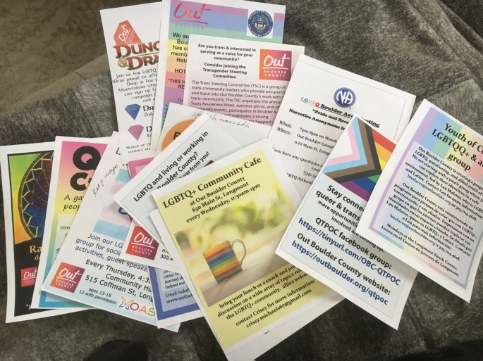
The original flyer was a mess. The overall layout, typography, color doesn’t look consistent with each other. There was no form of hierarchy. And certainly there was no design guideline to follow when making those flyers. Plus, most of the flyers didn’t have the Boulder logo on them. After gathering feedback from the group, we started by writing everything on Trello and then splitting off to create our own flyers based on meeting.


I redesigned the Gender Support quarter page flyer, and I was going for minimal, legible design that fit everything on a page. I used the LGBTQA gradient color palette to enhanced color variation on flyer. Overall, I liked the simple look. Other members of team also redesigned their own look. They used gradient background, white on black headline. They also added LGBTQA flag to identify the community. And the block gradient of contact information was also eye-catching. Overall, we all tried our best to redesign the template with different ideas.
After our first round design meeting, we decided to take Sam and Joia ideas and mix and drag some of the design elements into one flyer. We used Avenir since it was part of Out Boulder branding font. And we chose block gradient to presents contact information. At the bottom left, we added website and phone number in case someone wants to contact them.


We took a similar approach to redesign the youth groups flyer. Joia and Sam designed the flyers based on general flyer. They used gradient block to shows location and used white font to make it stand-out.
After finishing those flyers, we decided to add templates on Goggle Drive for Out Boulder to download. We included Photoshop files to edit and original file as well. For pint, we added PDF as well as Png in case web advertising. Photoshops file contains margin which was easy for print and we locked all layers so the template stays on brand.
Overall, our group worked out exceptionally well. And everyone participated in meetings and offered constructive feedback. I think with more time we could have redesigned more templates on Photoshop. I hope we were able to help LGBTQA community and they will use our designs to make their flyers more consistent.
